Category Archives: Blog

4C: Photography Activity

Light 1: Outside

Light 1: Outside

Light 2: Inside

Light 2: Inside

Focus 1 - Foreground

Focus 1 – Foreground

Focus 2 – Background

Composition 1 - Thirds

Composition 1 – Thirds

Composition 2 – Lead Room

I loved learning how to take charge of my camera and finally get some good results. For the first image I metered the center on the sky and lightened the foreground in Photoshop for overall good exposure. Then I took a photo of my friends’ baby in the beautiful natural window light in our extra bedroom. For the focus images, I took the same photo of matruska dolls, with plenty of window light coming in. (Otherwise I would have to gone outside.)  I used the macro option on my point-and-shoot camera to blur the background. Then I turned the macro off and focused on the plant in the background, which made the dolls blurry in the close foreground. I tried this a few times, but could not get it until I made sure there was plenty of distance between the two subjects.

Finally, I had fun taking an image at Bannack ghost town to show the rule of thirds. I put the barber chair right and cowboy boots on the one third lines and the top of buildings on a one-third line. Then for the last photo, I framed Max’s eyes on the one-third line, kept him to the side of the frame and faced him into the frame to allow lead room.


Prezi Presentation Project

Screen Shot 2016-04-28 at 4.37.08 PM

DESCRIPTION
Create an instructional presentation using the Prezi software to demonstrate it’s features and capabilities.

PROCESS (Programs, Tools, Skills, FOCUS principles)
I’m not very familiar with Prezi so I had first look at some example presentations to get an idea of what I could do. The process of creating my Prezi presentation went as followed:

1. After I researched, I chose an idea and then started sketching. I sketched out an idea that I had in my head regarding ways to be more creative. I chose to go with a light bulb as my graphic and then work around that. 4ANicoleNugentSketches
2. I opened up Photoshop and Illustrator and used both programs to create my background. I used my sketch as my basic foundation. I started creating the lightbulb in Photoshop and decided to add some brush strokes to give it more of an artistic feel and add some flare to it. I added the text and other elements so that they would be solidified in their position when I started working in Prezi.
3. Next I went into the heart of Prezi, added my background, and started editing. I added more of my content on the sides and then worked on the transitions.
4. I added background music to make it more enjoyable to read.

CRITIQUE PROCESS
I met with Jane Doe and John Smith for my critique via Skype and in person. It was helpful to meet with them because they pointed out some things that could be improved. For example, the font I chose for the numbered headings was too boring so I added the decorative font I used in the title. They also helped me with the transitions and best way to go about the flow of my presentation.

Facebook Critiques: Sam Iam and Donny Seuss
One-on-One Critique: Daryn Queen
Instructor Critique: It was recommended that I fix the background image to be of higher quality as it was appearing pixelated when zoomed up close.

MESSAGE
How one can develop skills to help them become more creative.

AUDIENCE
Human beings interested in becoming more creative.

TOP THING LEARNED
Prezi is a learning curve and takes some getting used to. I recommend others to watch tutorials if they are having struggles with it.

COLOR SCHEME & COLOR NAMES
Analogous // Brick, Orange, Gold

TITLE FONT NAME & CATEGORY
Pea Aubrey // Decorative

COPY FONT NAME & CATEGORY
Fir Sans // Sans Serif


THUMBNAILS OF ANY ORIGINAL, UNEDITED IMAGE(S) USED IN THE PROJECT

4ANicoleNugent-01

SOURCE OF EACH IMAGE (website name and hyperlink)
All graphics used were made by me.
The music is titled “Working Overtime” by robwalkerpoet / CC BY-NC 3.0 found on ccmixter.org.

Sample work by Nicole Nugent. To see more of her work, go here.


Magazine Cover Project

3ANicoleNugent

DESCRIPTION
Design a magazine cover that showcases a self-portrait as well as articles about yourself.

PROCESS (Programs, Tools, Skills, FOCUS principles)
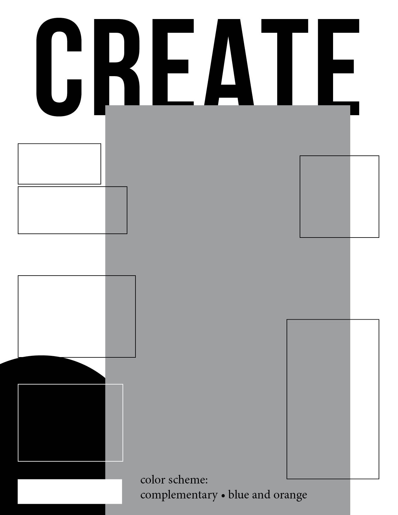
As I was looking at all the different magazine covers out there, I realized that I didn’t feel I fit with many of them. So I decided to create my own magazine titled “Create”. It’s a magazine for all the visual creatives out there.

The topics I chose for the articles revolved around my interests and hobbies. For example, I love everything to do with creativity. I love taking pictures and designing a variety of things. I have also always loved dance and music and those are a major stress reliever for me in my life. I also really love cats because they are adorable, soft, loyal, and hilarious.

The process of creating my magazine cover went as followed:
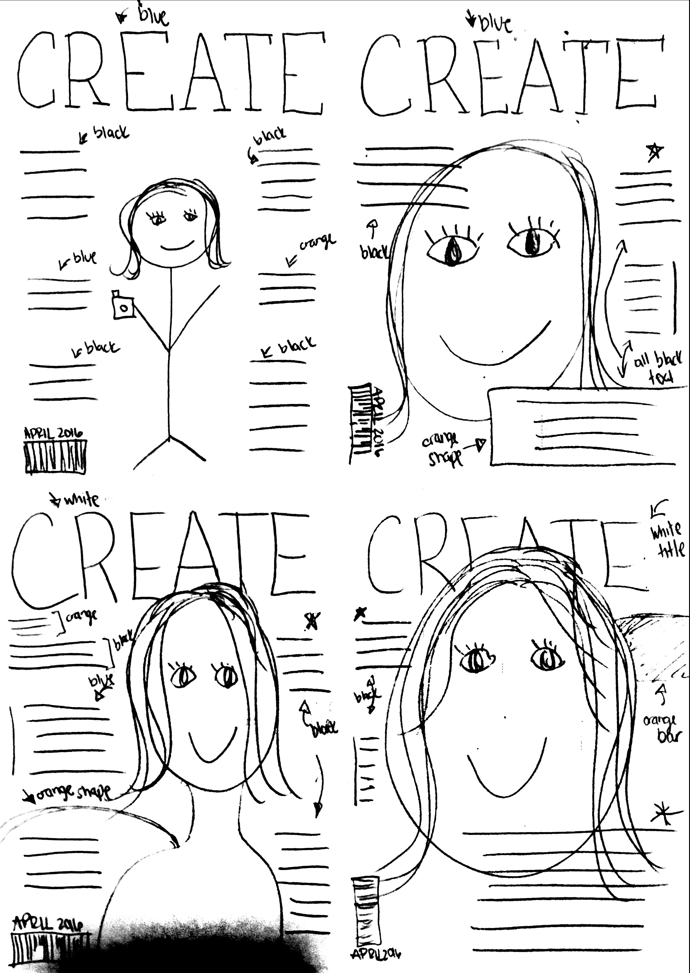
1. First I sketched out on paper some possible layouts of the magazine cover.
2. Next I created a shape map in InDesign of one of my sketches. 3ANicoleNugentShapeMapSketchesNicoleNugent
3. I then searched out a photo that I wanted to use as my self-portrait.
4. I opened the image in Photoshop and cut out the background so that I would be able to have the name of the magazine go behind my head.
5. Next I opened up InDesign and created a new 8.5 x 11 inch page.
6. I then placed in my PSD document.
7. I then duplicated it and put it behind the words “CREATE” so that I could have the background colors (I felt it was too boring with the white background.)
8. I then proceeded to add text boxes with all the different articles I wanted to include.
9. Once I was finished, I saved the InDesign file and then exported a JPEG at 150 ppi.

CRITIQUE PROCESS
I met with Jane Doe and John Smith for my critique via Skype and in person. These critiques were incredibly helpful because they helped me to notice things I didn’t notice since I was working on it for so long! The biggest thing that they said I needed help with was proximity in my articles. Since I had a lot of different articles it was very easy for it to be too chaotic, so I made sure to separate and use proximity more with the information. Some other advice given was to not have my head cover the words, but I personally thought it was a nice touch and made it feel more like a magazine so I decided to keep it. 

The people that I critiqued on Facebook were Sally Stars and Justin Thyme. I held a one-on-one critique season with Tyler Swift. The instructor critique video was very helpful as my instructor mentioned to pay attention to my color scheme. At first, the shades I picked of each color weren’t matching the best so I had to adjust those and now it looks a lot better.

MESSAGE
I wanted to express who I am through the articles and the overall style of the magazine.

AUDIENCE
Those who are interested in creativity and learning more about myself.

TOP THING LEARNED
The style of magazines is very different from what we are taught in terms of proper design principles.

COLOR SCHEME & COLOR NAMES
Complementary // Blue and Orange

TITLE FONT NAME & CATEGORY
Bebas Neue // Sans Serif

COPY FONT NAME & CATEGORY
Clavo // Hybrid of Oldstyle and Modern

THUMBNAILS OF ANY ORIGINAL, UNEDITED IMAGE(S) USED IN THE PROJECT

UtahLakeMe-1

SOURCE OF EACH IMAGE (website name and hyperlink)
The image is my own.

Sample work by Nicole Nugent. To see more of her work, go here.


Project 3: Photodesign

Hiringcorrectjs

Description: Demonstrate good photography and image editing skills. Incorporating color into a poster layout with original photo.
Process (Programs, Tools, Skills: I first formulated my plan by choosing a color scheme from the Visual FOCUS book for my layout, I decided on Split Complementary.  I went and capture a quality photo with good light, sharp focus, and nice composition.  I used my T3i Rebel Cannon camera. I then brought the photo into Photoshop and used these specific editing techniques: levels, sharpness, saturation, and color balance.  Then I design an 8.5×11 layout that including my photo, text, and repeating design elements. I incorporate my color scheme title, color swatches, and color names into my design.  I used the eye dropper tool and adjusted the color in the color picker to match a little more accurately. I loved the lines I created using the ellipse tool so I made a couple more and change the colors so they could be my swatch.  I then watched a Photoshop tutorial to find out how to type on a path in Photoshop.  I created three more ellipses and then hovered over an ellipse that was selected and named the color swatches.  Now my whole piece has the flow I envisioned.

Message: I wanted to make an appealing poster for the ORC that is currently hiring.  I wanted to incorporate an attractive fun color scheme to demonstrate my understanding of the color wheel.
Audience: BYU-Idaho Adventurous College students, who would like to work for the ORC.
Top Thing Learned: I learned how to plan and prepare for a photo shoot before taking a photo.  I learned how to pick a color scheme.
Color scheme: Split Complimentary color names: Brick, Blue and Gold
Title Font Name & Category: Gill Sans: Sans Serif
Copy Font Name & Category: Gill Sans: Sans Serif, Chalk Dust: Decorative
Thumbnail of original, unedited image inserted

Original


Project 9: Portfolio

Portfolio (Scribd.com):

Project Corrections / Time Spent: I spent an hour and a half redoing my Event Ad as well as half an hour improving the layout for my Flier. The corrections I made are the following: make sure you list all your corrections you made.  Also list why you made the changes.

Message: I want to showcase my work in a professional way.  I also wanted showcasing my unique, structured, fun and clean personality.

Audience: Potential client and employers.

Top Thing Learned: You should always sketch out ideas before you get on the computer.

Future application of Visual Media: I will look for opportunities to improve the quality of design in both my work place and my personal life (such as church).

Color scheme and color names: Monochromatic, blue

Title Font Name & Category: SkyFall Done – Decorative

Copy Font Name & Category: MinionPro – Oldstyle

Thumbnails of Images used:

background1 background2

Sources (Links to images on orginal websites):

http://www.ibjennyjenny.com/2012/08/5-free-soft-grunge-textures.html

http://www.texturex.com/Grunge-Textures/TextureX+spotted+grunge+rust+metal+stock+Texture.jpg.php


Project 8: Brochure

Front

P8-ChristinaClark-front

Inside

P8-ChristinaClark-inside

Back

P8-ChristinaClark-back

Video Showcase: 

Description:
A two sided (duplex) folding brochure.

Process (Programs, Tools, Skills):

I set up the gateway fold in Adobe InDesign. I split my layout into four sections with the concept that the two outer sections would be the flaps of the brochure and the two middle sections would be the ‘body’ of the brochure.

I used black bars throughout the brochure to create repetition and flow. I deliberately chose animal photos that showed green foliage in the background to create contrast against the pink and a thematic element to unite all the photos.

For the image of the flamingo I used the ‘quick selection tool’ in Adobe Photoshop to remove the background of the image. I then used the ‘refine mask’ dialogue box to smooth, feather, shift edge and apply contrast to the outline of the flamingo. The changes I made in the ‘refine mask’ dialogue box made a softer image that didn’t look so sharp and cutout against the brochure’s background. I then ‘placed’ the flamingo into InDesign where I used the ‘text wrap’ option to wrap my text around the ‘alpha channel’ of the image.

I created the logo in Illustrator using the pen tool and then I placed it into InDesign, where I used the scissors tool to cut the logo in half. I placed the left half on the right flap and the right half on the left flap so that when the brochure is folded the logo would come together nicely. Programs/Tools Used: Adobe InDesign/Adobe Illustrator/Adobe Photoshop

Message: Inform my audience about the Downtown Zoo. I am showing them through the brochure what is features are available through the zoo.

Audience: Families, large groups and animal lovers.

Top Thing Learned: I learned how to wrap text around an image in InDesign.

Color scheme and color names: Monochromatic,  violet

Title Font Name & Category: Arial Rounded MT Bold / Sans serif

Copy Font Name & Category: Minion Pro / Old Style

Word count: 303

Thumbnails of Images used:

bengal-tiger-3_z2s Original rhino2_Big white-tiger-singapore-zoo-1 Flamingo5

Sources (Links to images on original websites):

http://picasaweb.google.com/lh/photo/MCKSRKq3sszigFzn9INm4Q

http://pandasareawwwwsome.blogspot.com/

http://www.pittsburghzoo.com/ppganimal.aspx?id=22

http://www.singapore-vacation-attractions.com/zoo-animal-pictures.html

http://king-animal.blogspot.com/2012/09/flamingo.html#.UU3cuhyk_nY


Project 7: Web Page

Project Screenshot:
P7JakeSpencer

Description:
A web page designed to showcase a personally created logo.

Process (Programs, Tools, Skills):
I created this web page using only TextWrangler. I had never seen or written any HTML/CSS. It was interesting to see how you could make a web page by only using a simple text editor. It was also interesting to use the http://www.W3.org HTML validator. It was useful to have something check to see if I had any problems with my code.

After I marked up all my content and inserted my image, I attached a pre-made CSS document to my HTML. I then used the colors from my logo as the colors for my web page. I found these colors by opening Photoshop and using the eyedropper tool. I also changed my fonts to Times New Roman and Verdana. I declared some backup fonts just in case the viewer’s browser didn’t have these fonts. I also used padding around the logo and text so that they would not be too close to the edge of the web page. This was one of the most challenging parts of working with CSS. Programs/Tools Used: TextWrangler & Photoshop

Message: That my company Idaho Beekeeper is a resource for those interested in raising bees and selling local fresh honey.

Audience: Anyone who wants fresh honey or wants to learn about how to start a bee farm.

Top Thing Learned: How to change fonts and colors using CSS

Color scheme and color hex: Analogous: Yellow #f2ca14; lime #86742d; White #FFFFFF;

Title Font Families & Category: (all names)  Verdana, Geneva, serif; San Serif

Copy Font Families & Category: (all names) “Times New Roman”, Georgia, serif; Oldstyle

Changes made to the CSS: I changed the font families, and I also changed the colors to match my logo.


Project 6: Stationery

Letterhead:
evidence
Business Card (8.5×11 layout):
evidence2
Business Card (Large layout):
evidenceLargeLogo

Description:
Matching letterhead and business card designed using a personally created logo.

Process (Programs, Tools, Skills):
I created the logo using simple shapes in Adobe Illustrator. I also used the pathfinder tool to cut and combine these simple shapes. Once the logo was created, I opened a new two page InDesign document and placed my logo .AI file into this document.

I decided to make my first page a letterhead. I positioned the placed logo in the top right corner of my letterhead. I made sure to keep it at least .5″ away from the edges. I then typed my contact information into a text box and positioned it on the right hand side of the letterhead. I made my name 12pt font to contrast with the 8pt contact information. I added in a couple dashed lines to unify the information and to get some repetition. I also added a large black and white version of the brief case as a watermark. I kept the opacity to about 3%.

On my second page I used the rectangle tool to create the front and back outline of my business card. I then copied/pasted the logo and contact information onto this page. I kept the logo and contact information about the same size as the information on the letterhead. I made sure that no important information came any closer than 1/8″ from the edges. I also brought the dashed line into the business card to help unify the stationery pieces. Finally, I a enlarged the brief case and put half of it on the back of the business card. Programs/Tools Used: Adobe Illustrator & InDesign

Message: The company evidence incorporated is a private detective firm. Lawyers, and others who carry evidence, hold their documents in brief cases. The brief case symbol gives the logo a professional and organized feel.

Audience:  Anyone in need of an evidence incorporated detective firm or interested in working for one.

Top things learned: How to brand a company using a unified letterhead and business card design.

Color scheme: Complementary and color names: Blue and Orange

Title Font Name & Category: PT Sans Caption – Sans Serif


Copy Font Name & Category: STIXGeneral – Oldstyle


Project 5: Logos

Description:
Logo for an organization

Process:
This was really fun to create a logo in Illustrator. After trying out several drafts and ideas, I took a vote on which was the best. I chose the one I liked best and which was voted on most to refine. I refined the typography and font choices, working with bolded and italicized words to add contrast so they stand out. I also worked with font variations to help “come” stand out. I then used the pen tool extensively to manipulate “Family” to look just the way I wanted.=

Programs/Tools Used:
Adobe Illustrator

Message: There are good things to come for families in the gospel.

Audience: Families who want to do better

Top Thing Learned: How to draw using the pen tool

Color scheme: Complementary    color names: Brick and Teal

Font Name & Category: Rockwell Extra Bold (Slab Serif)
Font #2 Name & Category: Brush Script MT Italic (Script)


Project 4: Montage

P4RoaringRailMontage

Description:
An inspirational montage made by the blending of two or more images, and the use of typography.

Process:

  1. I cropped the background image to 8.5×11.
  2. I selected the conductor and moved him to the background image, then I added a mask.
  3. With black paint and a 100% opacity, soft-edged brush, I painted away the hard image edges.
  4. With a larger black brush at 30% opacity and 30% flow, I blended the image into the background, so it looks like he is melting into the secene.
  5. I repeated the process with the train ticket, but I did not lasso the ticket first. I just dragged the entire image to the background image and started masking it until it was a gradual blend.
  6. I added some type with two contrasting fonts and I added a layer style (soft, black shadow) to make the text more legible.
  7. Programs/Tools Used: Adobe Photoshop

Message: I wanted to convey a love of old trains.  Show my audience how these timeless beauties are a work of art and should be remembered.
Audience: Anyone interested in old trains or the 1930s-1960 vintage time period.
Colorized/Filter applied and where: I selected the train and increased the saturation to make the colors more vibrant.
Color scheme : Tetradic and color names:  Green, Red, Orange and Blue
Top thing learned: How to gradually blend two images
Font #1 Name & Category: Title: Museo Slab – Slab Serif
Font #2 Name & Category: Copy: Myriad Pro – Sans Serif

Thumbnails of Images used:

P4Conductor-CarynEsplin P4TrainTicket-CarynEsplin P4BackgroundTrain-CarynEsplin

Sources (Links to images on orginal websites):