
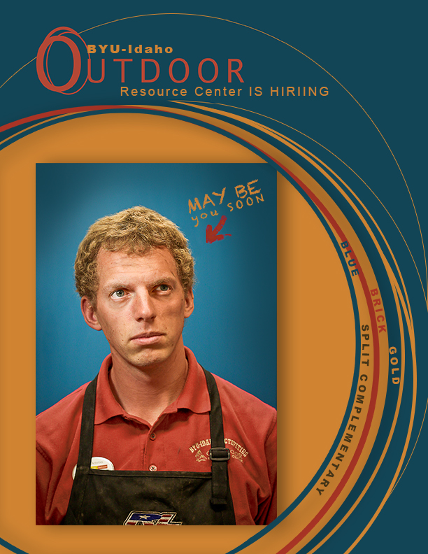
Description: Demonstrate good photography and image editing skills. Incorporating color into a poster layout with original photo.
Process (Programs, Tools, Skills: I first formulated my plan by choosing a color scheme from the Visual FOCUS book for my layout, I decided on Split Complementary. I went and capture a quality photo with good light, sharp focus, and nice composition. I used my T3i Rebel Cannon camera. I then brought the photo into Photoshop and used these specific editing techniques: levels, sharpness, saturation, and color balance. Then I design an 8.5×11 layout that including my photo, text, and repeating design elements. I incorporate my color scheme title, color swatches, and color names into my design. I used the eye dropper tool and adjusted the color in the color picker to match a little more accurately. I loved the lines I created using the ellipse tool so I made a couple more and change the colors so they could be my swatch. I then watched a Photoshop tutorial to find out how to type on a path in Photoshop. I created three more ellipses and then hovered over an ellipse that was selected and named the color swatches. Now my whole piece has the flow I envisioned.
Message: I wanted to make an appealing poster for the ORC that is currently hiring. I wanted to incorporate an attractive fun color scheme to demonstrate my understanding of the color wheel.
Audience: BYU-Idaho Adventurous College students, who would like to work for the ORC.
Top Thing Learned: I learned how to plan and prepare for a photo shoot before taking a photo. I learned how to pick a color scheme.
Color scheme: Split Complimentary color names: Brick, Blue and Gold
Title Font Name & Category: Gill Sans: Sans Serif
Copy Font Name & Category: Gill Sans: Sans Serif, Chalk Dust: Decorative
Thumbnail of original, unedited image inserted


Leave a comment